A Tale of Storybook and Tailwind CSS
Imagine this: You have a new project, the design is ready, and you’ve started implementing the user interface (UI) components. However, the logic hasn’t been implemented, and the application isn’t up and running. Despite this, your customers are eager to see the initial UI progress. That’s where Storybook comes to the rescue!
Introduction
As web developers, we recognize the significance of crafting engaging user interfaces (UIs) that elevate the user experience. React has emerged as a leading library for building UIs, and when paired with Tailwind CSS, a robust utility-first CSS framework, it forms a powerful alliance that enables the creation of stunning UI components.
This post will uncover practical tips for optimizing performance, ensuring accessibility, and leveraging the full potential of Storybook, React, and Tailwind CSS to create a seamless and delightful user experience across diverse web applications.
In this tutorial, we’ll be crafting a simple React application and incorporating Tailwind CSS for enhanced styling. As an additional feature, we’ll briefly explore Storybook to showcase our React components.
Storybook is an open source tool that simplifies the development, testing, and presentation of UI components in isolation. With Storybook, it’s possible to create an interactive library of independent components, streamlining the development and maintenance process of React UIs. Its ability to visualize and test components independently without navigating an entire application makes it particularly valuable.

Getting Started
Assuming you’re creating your application from scratch, the first step is to set up a React project. In this project, the aim is to integrate Tailwind CSS and subsequently incorporate Storybook while creating components that utilize consistent Tailwind classes. However, if you’re looking to integrate Tailwind into an existing project, feel free to skip this initial setup step.
You can create a new React project using npx and Create React App (CRA). For this example, call it tailwind-storybook:
npx create-react-app tailwind-storybook
Tailwind Setup
Now, you’ll introduce the tailwind CSS framework so that you can fully leverage all its advantages:
npm install -D tailwindcss
npx tailwindcss init
In the code above, you initiated Tailwind, together with the tailwind.config.js file. To use it across all the components, update the configuration:
// tailwind.config.js

module.exports = {
  content: [
    "./src/**/*.{js,jsx,ts,tsx}",
  ],
  theme: {
    extend: {},
  },
  plugins: [],
}
Additionally, import the Tailwind CSS configuration into the base CSS file. In this example, it’s the index.css file:
@tailwind base;
@tailwind components;
@tailwind utilities;
Great! The fundamental setup of Tailwind is now complete, and you can make use of its CSS functionalities. But first you’ll conduct a test, outlined below, to ensure everything is functioning as expected.
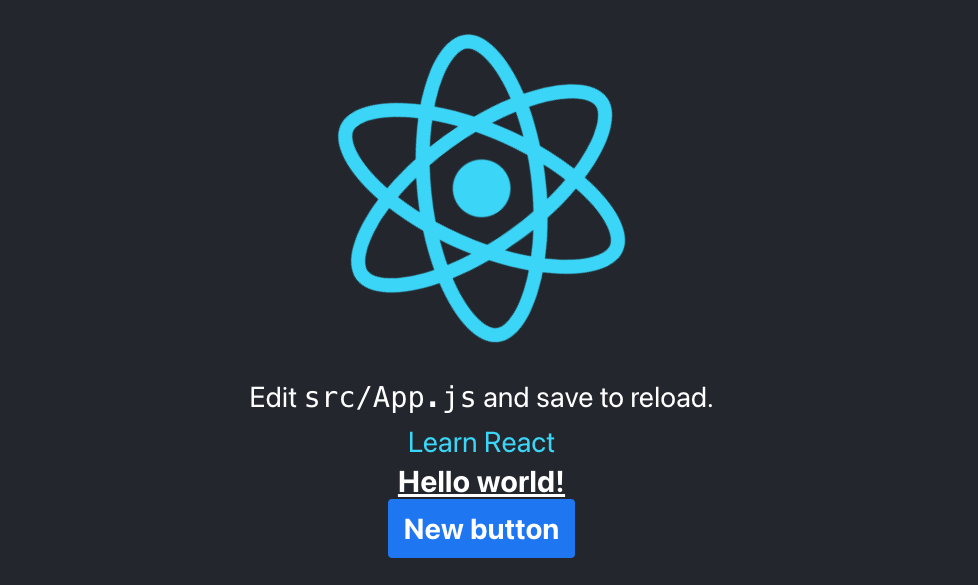
More specifically, you can experiment with Tailwind CSS by adding a new h1 element to the existing demo page elements. Use the following code to test how Tailwind styles this new element:
...
<h1 className="text-3xl font-bold underline">
  Hello world!
</h1>
...
Tailwind classes are intentionally designed to be highly readable, and their names provide clear indications of the styles they apply. This readability allows users to easily understand which styles will be applied to the elements. In the context of Tailwind CSS, applying the flex class directly translates to the utility class flex, which, when added to an HTML element, automatically sets the display property to flex, in turn streamlining the styling process with Tailwind’s utility-first approach.
Now, take a moment to examine the running application to ensure that the newly added element has properly applied the Tailwind classes.

Storybook Initialization
Now that you’re running your React app together with Tailwind, you’re ready to add Storybook to the mix:
npx storybook@latest init
Once you’ve initialized Storybook, you’ll have the stories folder with some examples of components, stories, and files for styling. You can either take a look at the given examples or introduce your own components and stories.
First Component
You’ll establish the project’s structure first. Inside the src folder, initiate a directory called components. Within this directory, your next step involves crafting a new file named Button.js.
Here’s the content that should be included within this Button.js file:
// src/components/Button.js

import React from 'react';
import PropTypes from 'prop-types';

export const Button = ({ label, onClick }) => {
  return
  <button
      onClick={onClick}
      className={"bg-blue-500 hover:bg-blue-700 text-white font-bold py-2 px-4 rounded"}>
        {label}
  </button>;
};

Button.propTypes = {
  label: PropTypes.string.isRequired,
  onClick: PropTypes.func.isRequired,
};
In this example, you’re using Tailwind CSS classes to style the button. The bg-blue-500, hover:bg-blue-700, text-white, font-bold, py-2, px-4, and rounded classes are applied to the button to give it the desired appearance.
You can import this component into the App.js file to render it to the main page:
...
<Button onClick={()=>{
    console.log('click')}} label={'New button'} />
...
First Story
Now that you have your first component, you can create your first story. By default, Storybook will load stories from your project based on a glob (a pattern-matching string) in .storybook/main.js|ts that matches all the files in your project with the .stories.* extension. The intention is for you to colocate a story file along with the component it documents.
Now, with this in mind, create a new file named Button.stories.js and place it beside the Button component. Ensure it has the following content:
// src/components/Button.stories.js

import { Button } from './Button';

export default {
    title: 'Button',
    component: Button,
};

export const Primary = {
    args: {
        primary: true,
        onClick: () => {
            console.log('clicked')},
        label: 'Button',
    },
};
Now you can run Storybook:
npm run storybook
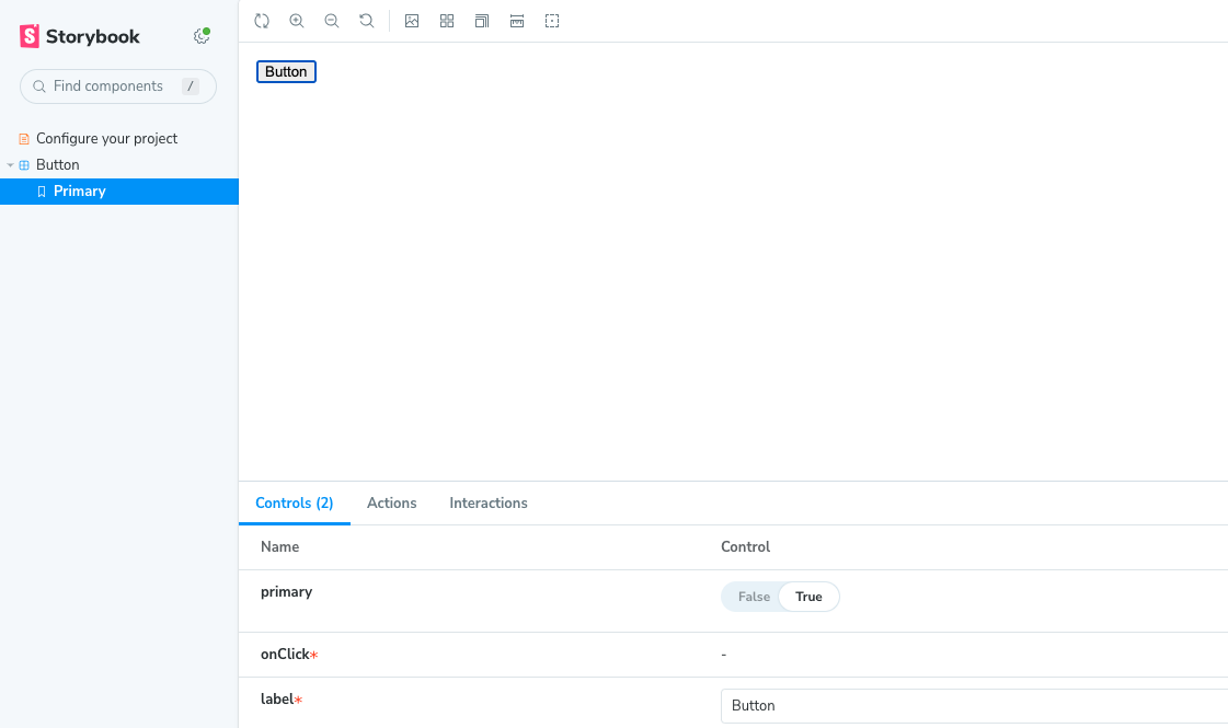
In Storybook, the left-hand side displays your collection of available stories. Currently, you have a story dedicated to the Button component, which showcases various props and configurations. To enhance organization, you can group your stories following a methodology like Atomic design. Grouping stories helps to categorize components based on their complexity and allows for better navigation and clarity in the Storybook interface. This way, you can maintain a well-organized and structured Storybook, making it easier to manage and explore the different components and their variations.
Storybook with Tailwind
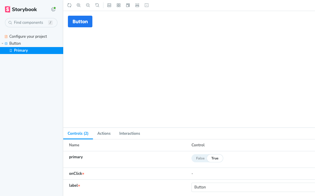
One important observation is that when using Storybook, the default button may not display the styles you applied to the Button component using Tailwind CSS classes. To address this issue, you can import the Tailwind CSS file into your preview.js file located in the .storybook directory. By doing this, the styles will be applied consistently across both the actual application and the Storybook environment, ensuring a cohesive representation of the components.
import "tailwindcss/tailwind.css";
Now you’ll be able to see the properly styled component with Tailwind.
Storybook Functionalities
From now on, you can leverage the advantages of Storybook’s functionalities. It offers developers a wide range of options and configurations to tailor the behavior and appearance of their Storybook environment. Some of these common options include:
Configurations — Storybook has a configuration file in the .storybook directory called main.js. This file allows you to customize various aspects of Storybook, such as the project name, entry point of stories, addons, and more.
Addons — Storybook supports a rich ecosystem of addons that extend its functionality. These addons can be added and configured in the addons.js file, allowing you to enhance Storybook with additional features like accessibility checks, documentation generation, and more.
Theming — You can customize the appearance of Storybook to match your brand or design preferences. This includes changing the colors, fonts, and other styles of the Storybook UI.
Viewport — Storybook allows you to define different viewports to see how your components respond to different screen sizes and resolutions. This is useful for testing responsiveness.
Controls — With the Controls addon, you can add an interactive control panel to your stories. This allows you to tweak component props and states directly from the Storybook UI.
Decorators — Decorators are higher-order components that wrap around your stories, allowing you to apply global styles, context providers, and other customizations.
Story Parameters — You can add metadata to your stories using parameters. These parameters allow you to provide additional information — such as component descriptions, notes, or specific configurations — to the Storybook UI.
Docs Mode — Storybook can operate in “Docs Mode,” in which it generates automatic documentation based on your component’s prop types and other metadata. This simplifies the process of maintaining up-to-date documentation alongside your components.
Storybook Server — You can customize the server configuration for running Storybook, such as specifying a custom port or host.
Storybook Manager UI — Storybook also provides options for customizing the Manager UI itself, allowing you to add custom UI elements or override existing ones.
These options can be configured in the Storybook configuration files, which can be found in the .storybook directory of your project. By utilizing these options, you can tailor Storybook to fit the specific needs of your project and streamline your component development workflow.
Now that we’ve established a foundation with the basic configuration options and functionalities of Storybook, let’s enhance our existing Storybook setup by incorporating an intriguing additional functionality.
Connecting Two Components in Storybook
One of interesting usages of Storybook can be connecting two components and demonstrating how they work together. Since you already have the Button component, now you can introduce a second component:
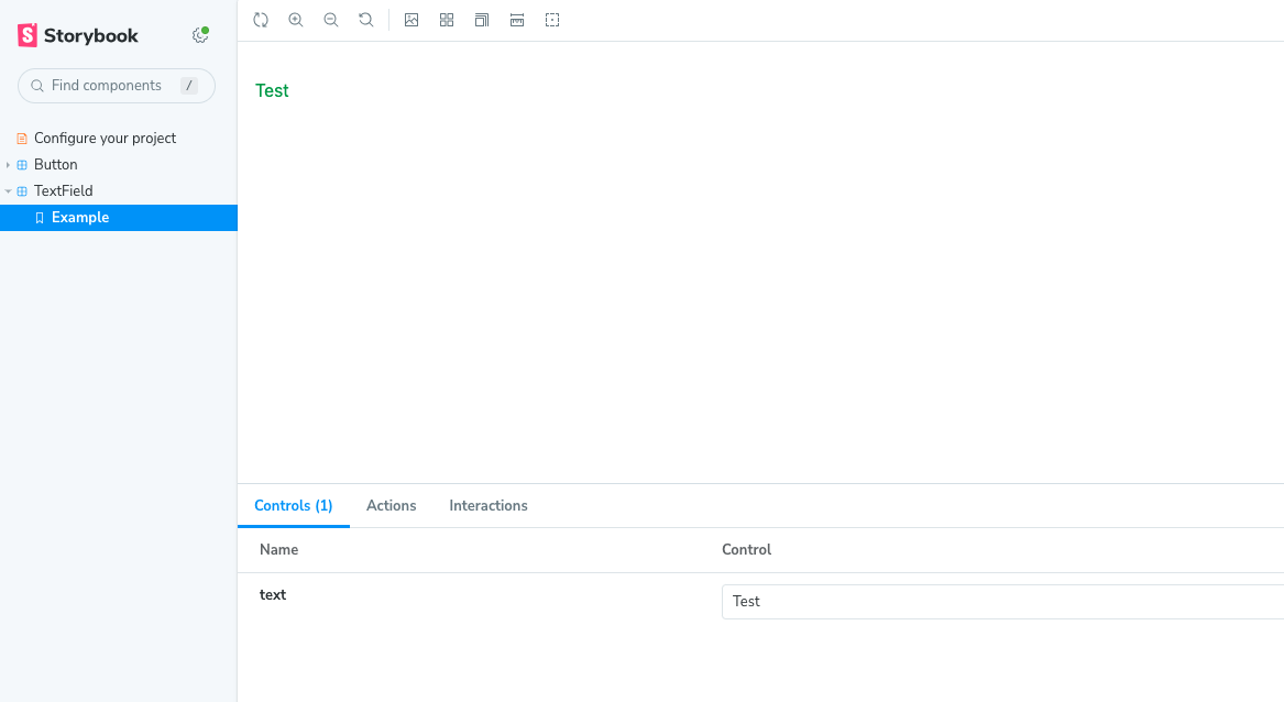
// src/components/TextField.js

import React from 'react';

const TextField = ({ text }) => {
    return (
        <p className={'text-green-600 mt-4'}>
            {text}
        </p>
    );
};

export default TextField;
As you can see, the above is a simple component that displays styled text provided by prop.
You can create a story for it as well:
// src/components/TextField.stories.js

import TextField from "./TextField";

export default {
    title: 'TextField',
    component: TextField,
};

export const Example = {
    args: {
        text: 'Test',
    },
};
And here’s a preview of the TextField story:
This demonstrates combining two separate components and exploring their potential when used together. The objective is to evaluate the seamless integration and observe the collaborative effectiveness of Storybook stories when used in conjunction with each other. In this scenario, these components will be placed side by side to showcase their collaboration and the creative opportunities that arise from their interaction.
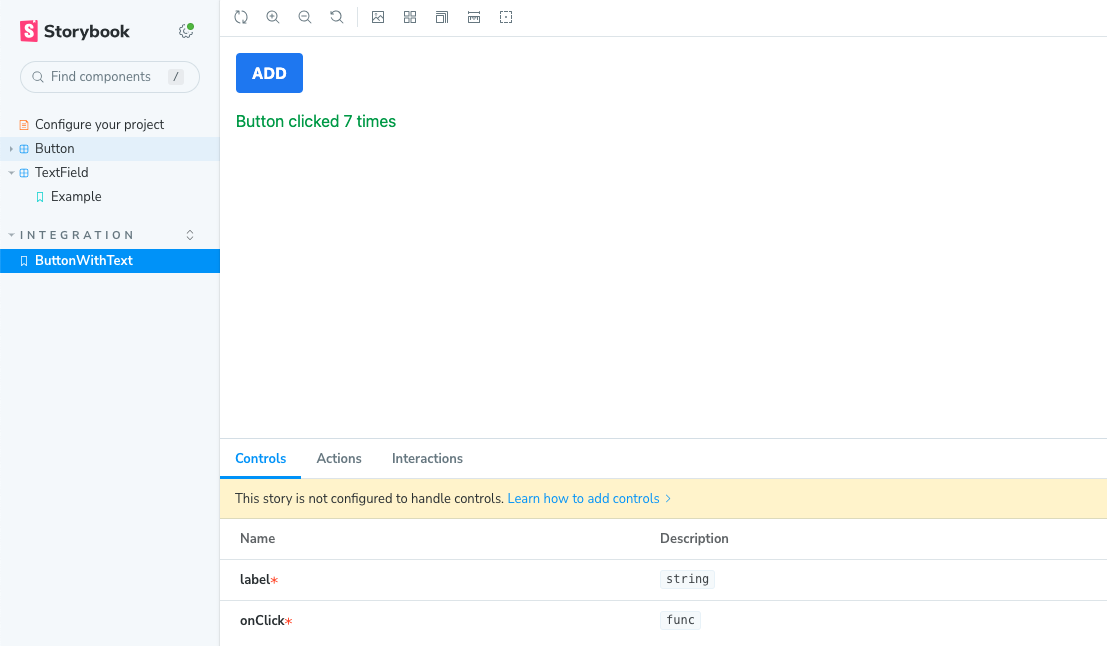
Let’s examine the ultimate implementation of the combined component and observe how it functions in real-world scenarios:
// ButtonWithText.stories.js

import {Button} from "./Button";
import TextField from "./TextField";
import {useState} from "react";

export default {
    title: 'integration/ButtonWithText',
    component: Button,
};

export const ButtonWithText = () => {
    const [count, setCount] = useState(0);
    const handleButtonClick = () => {
        setCount((prevCount) => prevCount + 1);
    };

    return (
        <>
           <Button onClick={handleButtonClick} label={"ADD"} />
           <TextField text={`Button clicked ${count} times`} />
        </>
    );
};
Here’s a preview:
Addons
The additional functionalities of your application, such as the router or internationalization, can also be seamlessly incorporated into your stories. This is where addons come into play, offering extra functionalities that enrich Storybook and enhance the overall web development experience.
To utilize a specific addon, it’s standard to install it as a package and then import it into the main.js file. For example, if you have the i18next internationalization tool, you can easily showcase the behavior and appearance of a real component with translation in your stories.
Moreover, many single-page applications (SPAs) benefit from routing abilities. In the case of React, the widely used react-router tool enables seamless routing through different pages. By leveraging Storybook with addons, you can effectively showcase the actual routing behavior to your clients without the need for the full application to be up and running. This allows for rapid prototyping and real-time feedback on application navigation, making the development process more efficient and streamlined:
// .storybook/main.js

module.exports = {
	...
  addons: [
		...,
		"storybook-addon-react-router-v6",
		"storybook-react-i18next",
		...
	],
	...
};
Conclusion
In conclusion, Storybook has proven to be a game-changer in web development and at 3AP as well, enabling efficient testing and fine-tuning of UI components. Its organized interface provides a clear view of each element, ensuring flawless functionality. In our project, showcasing the current component presentation proved invaluable, as it allowed us to gather early feedback from clients before implementing all application functionalities. This approach enabled us to keep clients updated and make necessary adjustments based on their input.
Meanwhile, Tailwind CSS’s utility-first approach and extensive predefined classes offer unmatched styling flexibility for creating visually stunning interfaces. When Storybook and Tailwind CSS combine their strengths, the result is a seamless integration that accelerates development cycles and fosters real-time collaboration.
Embracing this powerful duo empowers web developers to elevate their projects, unlocking new levels of productivity and aesthetic finesse.