Using Shared Components across Multiple Applications
Contents
How many times have you been in a situation where you had to implement a new UI into brand-new or existing applications? Suppose your designer provided you with a design and style guide; what would your approach to getting the given styles in place be?
Introduction
While working on a project for a customer, we can have a variety of approaches for the same solution. Most of the time, we’ll face a scenario with a single application that delivers a solution to the customer. But it may be that we have multiple applications that work together and provide some value to the end user. This post is about one possible approach for working on a project with multiple applications with a common style.
This scenario came up when we were working on a health insurance project where we had to implement several independent web applications. However, since they were all part of the same solution, they needed to follow the same style guide. Instead of writing custom components for every application, we tried to abstract as many components as we could and share them among all related apps. Using this solution, we managed to organize our code to be easily maintainable and enjoyable to work on, and this post provides some insight into how we did it.
Using Well-Known Third-Party Libraries

Designers often rely on popular UI frameworks when designing a new application. For example, you can see Material Design across well-known Google services, and the Bootstrap toolkit offers out-of-the-box UI solutions that many developers take advantage of. Putting UI concept and design solutions aside, using these kinds of frameworks should be straightforward from a frontend developer perspective: We have a set of components and a set of functionalities that we only need to apply in given cases.
But what if the designer wants something unique and recognizable that will follow a client’s existing style pattern? In such a case, we have to put some extra effort into creating new styled components with all the necessary functionality, and then we have to implement them across all applications.
A Modular Approach
Because our scenario involved some commonly used elements, which are abstracted and context independent, we ended up working with modules. We can describe a module as an element that has a unique and specific set of functionalities that aren’t tied to a single website or layout. Module elements should be independent of context, and they should only deliver a portion of the functionalities that belong to them.
For our project, instead of writing or copying the same design solutions multiple times, which in turn would result in a lot of unnecessary maintenance, we created reusable code to share across all our project’s applications.

Reusable Styles
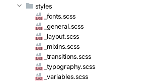
Styling an application from scratch first requires getting styles in place, and the style guide needs to be remapped to the code itself. We divided styles into a few SCSS files and exported them to be usable across all style files. Styles should be well grouped to be easily readable and maintainable.

The following is an example taken from the code we wrote. All the given sizes, colors, and spaces can be placed in SCSS variables, which brings uniformity and consistency to our components:
$font-size-base: 16px;
$font-size-xxs: 0.625rem;
$font-size-xs: 0.75rem;
$font-size-s: 0.875rem;
$font-size-m: 1rem;
$font-size-l: 1.125rem;
$font-size-xl: 1.25rem;
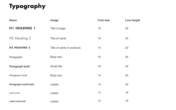
Since the typography was provided by the designers, we remapped it into a single style file, as shown below.

html {
  font-size: $font-size-base;

  body {
    font-family: $font-arial;
    font-size: $font-size-m;
    font-style: normal;
    font-weight: $font-weight-regular;
  }

  input::-ms-clear {
    display: none;
  }
}

.paragraph {
  font-family: $font-arial;
  font-size: $font-size-m;
  color: $color-gray1;
  line-height: 22px;
  font-weight: $font-weight-regular;
  &-s {
    @extend .paragraph;
    font-size: $font-size-s;
  }
  &-b {
    @extend .paragraph;
    font-weight: $font-weight-bold;
  }
}
We also declared font variables and placed them in a separate file:
@import 'variables';

@font-face {
  font-family: 'Futura Std';
  src: url('../fonts/futuraLight.eot');
  src: url('../fonts/futuraLight.eot?#iefix') format('embedded-opentype'),
    url('../fonts/futuraLight.woff') format('woff'),
    url('../fonts/futuraLight.woff2') format('woff2'),
    url('../fonts/futuraLight.ttf') format('truetype');
  font-weight: $font-weight-thin;
  font-style: normal;
}

@font-face {
  font-family: 'Futura Std';
  src: url('../fonts/futuraBold.eot');
  src: url('../fonts/futuraBold.eot?#iefix') format('embedded-opentype'),
    url('../fonts/futuraBold.woff') format('woff'),
    url('../fonts/futuraBold.woff2') format('woff2'),
    url('../fonts/futuraBold.ttf') format('truetype');
  font-weight: $font-weight-bold;
  font-style: normal;
}

@font-face {
  font-family: 'Futura Std';
  src: url('../fonts/futura.eot');
  src: url('../fonts/futura.eot?#iefix') format('embedded-opentype'),
    url('../fonts/futura.woff') format('woff'),
    url('../fonts/futura.woff2') format('woff2'),
    url('../fonts/futura.ttf') format('truetype');
  font-weight: $font-weight-regular;
  font-style: normal;
}
Additionally, we were able to group some general code that should be applied to all pages. All unspecific common classes that we often reuse — like wrappers, common header styles, and labels — were placed in a mixin file:
@import 'variables';
@import 'typography';

.input-field {
  width: 100%;
  height: 42px;
  border: 1px solid $color-gray3;
  border-radius: $border-radius-default;
  margin: 4px 0;
  padding: 12px 8px;
  background: $color-white;
  line-height: 0 !important;
  &:focus {
    outline: none !important;
    border: 1px solid $color-green2;
  }
  &.disabled {
    &:focus {
      border-color: $color-gray3;
    }
  }
}

.input-field-wrapper {
  display: flex;
  flex-direction: column;
  height: 88px;
  max-width: 100%;

  &.single {
    height: auto;
  }
}
Components as Modules
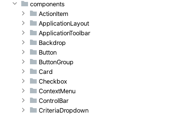
Once the styles were described and mapped, we were able to reuse them in project-specific components. We basically have all input field types, and we prepared them as components, styled them using our shared styles, and implemented basic functionality. As we develop the application further, component features could be adopted, but they shouldn’t have any application logic in them if possible. As such, they won’t contain any business logic, and therefore, they can be used in any context.

For example, in our project, we have the dropdownWithSelection component, designed according to our style guide, which we use across all project applications. It has a limited set of functionalities that match the needs of our applications, along with a few optional features depending on our current use case. This is a specific component that provides us with an input field with multiple selection options. To match every use case (where it makes sense), we have optional props that should tell the component what features should be included:
 value: {
      type: String,
      default: '',
    },
    label: {
      type: String,
      default: '',
    },
    placeholder: {
      type: String,
      default: '',
    },
    options: {
      type: Array,
      default: () => [],
    },
    optionValue: {
      type: String,
      default: 'id',
    },
    optionText: {
      type: String,
      default: 'text',
    },
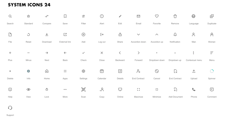
Another component worth mentioning is the Icon component. Since we’re not using popular icon libraries, we had to find a solution to prepare all the required and given icons as components.

The provided SVG icon declaration is used to prepare a specific icon component with a single optional prop — in our case, color:
<template>
  <svg viewBox="0 0 24 24" fill="none" xmlns="http://www.w3.org/2000/svg">
    <path
      d="M12 14.1716L18.4853 7.68629L19.8995 9.10051L12 17L4.10051 9.10051L5.51472 7.68629L12 14.1716Z"
      :fill="color"
    />
  </svg>
</template>
<script>
import { iconMixin } from '../iconMixin';

export default {
  props: { ...iconMixin },
};
</script>
Instead of exposing all icon components, all the prepared specific icon components were imported into a single common Icon component, which was shared across all applications. This common icon component accepts all necessary props and transfers them to the required icon component (e.g. the AccordionUp component). Additionally, icon names can be placed and exported from some general objects for easy use:
<template>
  <component class="icon" :is="componentName" :color="color" :class="style" />
</template>
Meanwhile, in the component where we consume those icons, we can just import the common icon component and pass the icon name and required prop:
<shared-icon green :name="$I.CHECK" />
Example
Let’s look at a complete example of component use. Here’s the case of a commonly used Button component. Since it has variety of use cases, we have multiple props that define our component:
<template>
  <button
    class="shared-button"
    :class="{
      primary: !secondary && !tertiary,
      secondary,
      tertiary,
      small,
      error,
      abort,
      'with-icon': !isEmpty(icon),
    }"
    :data-testid="cy"
    :type="type"
    :disabled="disabled"
    @click="!disabled && $emit('button:click')"
    :form="formId"
  >
    <shared-icon v-if="!isEmpty(icon)" :name="icon" />
    <slot></slot>
  </button>
</template>

<script>
import { isEmpty } from 'lodash-es';
import SharedIcon from '../Icon/SharedIcon';

export default {
  name: 'SharedButton',
  components: { SharedIcon },
  props: {
    secondary: {
      type: Boolean,
      default: false,
    },
    tertiary: {
      type: Boolean,
      default: false,
    },
    disabled: {
      type: Boolean,
      default: false,
    },
    small: {
      type: Boolean,
      default: false,
    },
    error: {
      type: Boolean,
      default: false,
    },
    abort: {
      type: Boolean,
      default: false,
    },
    type: {
      type: String,
      default: '',
    },
    cy: {
      type: String,
      default: '',
    },
    formId: {
      type: String,
      default: '',
    },
    icon: {
      type: String,
      default: '',
    },
  },
  data() {
    return {
      isEmpty,
    };
  },
};
</script>

<style lang="scss" scoped>
@import 'SharedButton';
</style>
Since it’s not a complex component, it doesn’t have any special logic, and most of the passed props are used for shaping the UI of the button. Sometimes we need to show an icon instead of text, so we have an optional icon prop with the name of the desired icon. The button can only have one action, which triggers an event that we can catch in the client component and map to the required action.
From the perspective of the client application component, all we need is to import and use it — of course, with necessary props and the content/button text:
<shared-button
  @button:click="submitMainAction"
  class="submit-button"
  cy="composite.answer"
  small
>
  {{ $rms('health.question.diagnosis.finished') }}
</shared-button>
And when an action is submitted or a button is clicked, the following method is called:
submitMainAction() {
  this.$router.back();
},
Other Common Features
In multi-application solutions, we often encounter common features that we have to rewrite in every frontend application. Where it makes sense, we should move them into a shared module and just reuse them in the client application. In our case, every application in our project had the same security setup, so it made sense to share the authorization across all of them. Since the functionality is the same, it also made sense to move this setup into a shared component and maintain it only in one place.
End-to-End (E2E) Integration
Sometimes, it’s necessary to implement features that require adopting shared components. For example, we could have to add and implement e2e tests, which cover some of the shared components. To implement them, we have to put the markers into, for example, text input field components so that we can map those fields when running e2e tests.
But what if we have to test some form with multiple text fields? Since this is a shared component, all the fields have the same markers, right? The convenient solution is to pass the marker as a prop from the usage component and to mark the component from the client application itself, and not from the shared component. This makes it easier to differentiate between them:
cy: {
  type: String,
  default: '',
},
<input
  :data-testid="cy"
  readonly
  :placeholder="placeholder"
  :value="selectedOption[optionText]"
  @focus="open"
/>
Deployment and Use
Once we had a shared component prepared and ready to use, the only thing left was to inject it into the client application where it was needed. One possible solution was to publish the repository as an npm package. In the CI setup, we ran a script to increase the version on every push, which ensured proper versioning. The CI setup can also publish, so we didn’t need to take any action beyond pushing code updates:
jobs:
  build:
    runs-on: ubuntu-latest
    steps:
      - uses: actions/checkout@v2
      - uses: actions/setup-node@v2-beta
        with:
          node-version: '12'
          registry-url: 'https://npm.pkg.github.com'
          scope: '@target-scope'
      - run: git config --global user.name ${{ env.GIT_NAME }}
      - run: git config --global user.email ${{ env.GIT_EMAIL }}
      - run: npm version patch -m "[skip ci] release %s"
      - run: npm ci
      - run: npm run lint
      - run: npm run build
      - run: git push
      - run: git push origin --tags
      - run: npm publish
        env:
          NODE_AUTH_TOKEN: ${{ secrets.GITHUB_TOKEN }}
If we want to keep the package private, we need to provide the authentication token to the client application so that we can access the npm package. The token should be provided from the .npmrc file, from the root of every client application:
registry=https://npm.pkg.github.com/shared-components
//registry.npmjs.org/:_authToken=${NPM_TOKEN}
Downsides
The difference between making custom components for a single application and making modular, shared components is that we have to pay attention when updating/adding functionalities to existing components. More specifically, we have to make sure an update won’t break existing use cases, since we can have several different uses of same component or piece of code. It won’t be a problem if there are only a few instances of the component/code, but if you have a very common component — like a text input field — testing all the use cases can cost time. In such a scenario, setting new features as optional, with default values where they aren’t used, can be handy.
Another possible downside could be that the UI library version has to be compatible with the one used in the client application. In our case, we used Vue.js v3, which is backward compatible with v2. But in some libraries, you may face some compatibility issues between release versions.
Conclusion
This post provided an overview of how we used shared components across multiple applications in a single project. Modularization of the frontend requires some extra work in the beginning, but it leads to a much cleaner and more easily maintained codebase. It not only helps you work faster, but it can help new people get familiar with the whole project in less time. Additionally, well structured code reduces the complexity of your entire project.